How to Use Color in Home Decor
This post may contain affiliate links · This blog generates income via ads
As much as I enjoy a base of neutral colour like white or soft grey, I LOVE adding in pops of colour through accents and accessories in my home! As part of my Simple Decorating Tips series, today I want to share with you some simple tricks on how to use colour in your home decor – plus I’m giving you a free printable PDF color wheel for your reference!

One great reference for choosing any colour scheme is the colour wheel. I’d recommend printing one off or having one on your home for quick inspiration.
Click here or on the image below to download your FREE printable PDF color wheel to use as a reference when you’re decorating your home with colour:
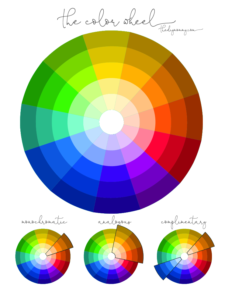
The colour wheel is comprised of 3 primary colours – red, yellow & blue, three secondary colours – orange, purple and green, and some tertiary colours made by mixing the secondary colours together.
There are three main colour schemes you can use in your home decor:

Monochromatic
This is when you use one colour from the colour wheel only. You can use shades of the colour (lighter or darker) and mix it with a neutral colour like black, white, grey and brown. This is a simple & clean colour scheme. In the photo above, I’m using shades of green with neutral colours.
Analogous
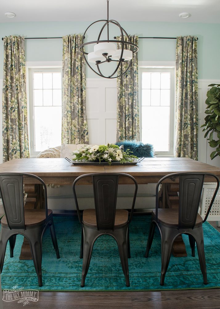
This is when you use two or three colours that are next to each other in the colour wheel. For example: green and blue. This produces a calm and natural colour scheme. In the photo above I’m using shades of green and blue with neutral colours.
Complimentary
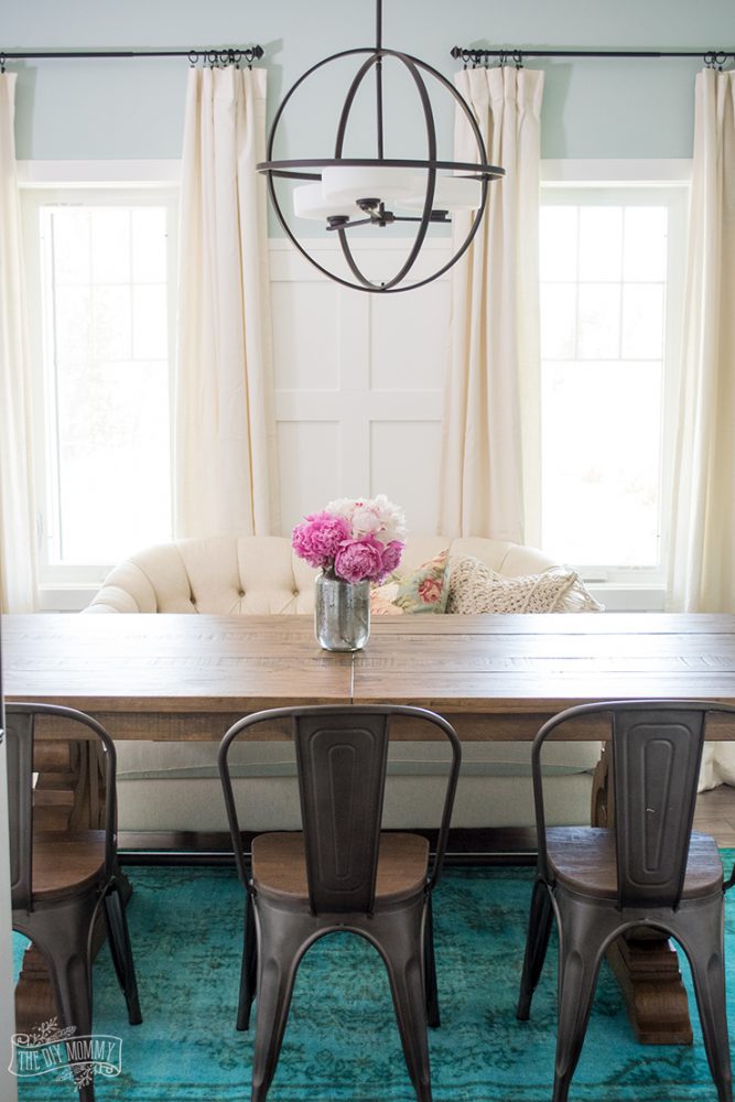
This is when you use two colours that are opposite each other in the colour wheel. This is a more vibrant design. To tone it down, use lighter or darker shades of each colour. For example: mint green and blush pink instead of bright green and red. In the photo above, I’m using shades of pink, green and neutrals.
The 60 – 30 – 10 Tip
If you’re using more than one colour in your design, use the 60-30-10 rule to decide how much of each colour you want to use in your decor. Let one colour take up 60% of the room, one take up 30% and one take up 10%. I like to use a neutral colour as the 60% colour, a soothing accent colour like blue as the 30% colour and a brighter colour like green as the 10% accent colour. This would also be considered an analogous colour scheme since I’m using two colours beside each other in the colour wheel.
Warm and Cool Colours
Colours on the “red” side of the colour wheel like red, yellow and orange feel warm and cozy while colours on the “blue” side feel calm and cool. Remember this when you’re choosing the colour scheme for your home.
Hi there, I googled free printable color wheel and your site came up. Thank you for the advice on the 60-30-10 rule. I can’t seem to find a printable color wheel like the one shown above. Would you be able to email one to me at [email protected]?
Christina might not be getting notifications of replies on this anymore, or maybe she just emailed you. If not all you need to do is click the link after the first picture or on the color wheel itself to open the PDF printable version.
Or click this.
https://thediymommy.com/wp-content/uploads/2018/03/The-Color-Wheel-for-Home-Decor-The-DIY-Mommy.pdf
That’s right! Thanks Becky!
Would like info on how to decorate with small all the way to large wall mirrors to make the condo feel bigger and accentuate the views from end of condo balcony.
Also how to use different flooring type materials (tile, wood laminate when see each type from adjoining rooms. And how to different types where rooms join (I.e., adjoining rooms with different laminate colors or designs do I slant laminate of one room on 45 degree angle to vertical laminate in adjoining room or repeat same design pattern in the layout)