Don’t make these mistakes when choosing paint colors for your home
This post may contain affiliate links · This blog generates income via ads
One of the most budget friendly upgrades you can make to your home with the biggest impact is painting your walls. But what’s the best way to go about choosing paint colors for your interior? What mistakes should you avoid? Let’s talk about it!
Today’s question for the podcast:
What’s the best way to choose interior paint colors?
Mary, 2021 Blog Survey
LISTEN TO TODAY’S PODCAST to learn mistakes to avoid when choosing pant colors:
SUBSCRIBE TO MY PODCAST:
Mistake 1: You haven’t determined the mood you want to create
Planning is everything when it comes to renovating a room in your home. Determining the mood you want to create with paint is a good first step to finding the perfect color. If you don’t plan the mood of your room in advance, your completed space will most likely feel disjointed.
One way I like to plan the feel of a room makeover is to browse Pinterest and create a Board with photos of rooms I love. For example, if you want to paint your living room start Pinning images of beautiful living rooms you’d like to emulate. You should start to see a pattern from photo to photo. This will help you determine the style & mood you’re going for in the space.
Need help naming your style once you’ve gathered inspiration images? Click here to take my home decor style quiz… it’s free!
Wall color is HUGE when it comes to setting a mood in your home. Here’s a helpful graphic showing how different colors can make you feel:
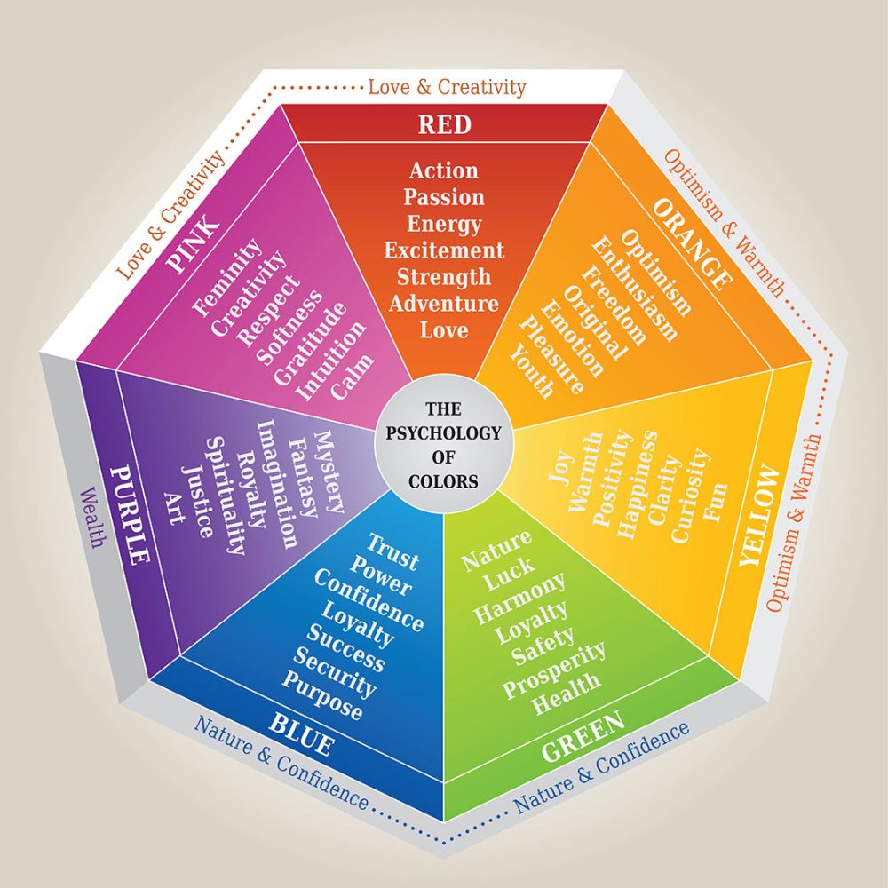
Color Psychology
- RED can add energy, passion and excitement to your space. It’s great for a more modern feeling room, and a space that you want to feel energized in.
- ORANGE feels optimistic and youthful. This might be a nice color for a kids’ room or workout area.
- YELLOW is a joyful, fun color that can instantly boost your mood. It’s a fun choice for an entry or kitchen.
- GREEN makes us think of nature and health, and it can have calming effects. I love it for almost any room.
- BLUE feels confident and secure, and it’s a safe colour for almost any wall in a home.
- PURPLE can create intrigue and reminds us of royalty. It could be a fun colour for a kids’ room or in a deeper tone for a formal room.
- PINK is feminine and calm and is a nice choice for any room where you want to create a soft mood. I love it for bedrooms.
- WHITE represents purity and creates the feeling of space. You can make a room feel a lot larger by using white paint. It’s also a good choice if you want to use colorful accents.
- BLACK can be a very powerful colour that can feel extremely elegant. It’s best to use in small doses because it can make a room feel small.
When you’ve determined the MOOD and STYLE of the room your want to create, this will help you pick a paint colour family. Then, you can narrow down your choices from there.
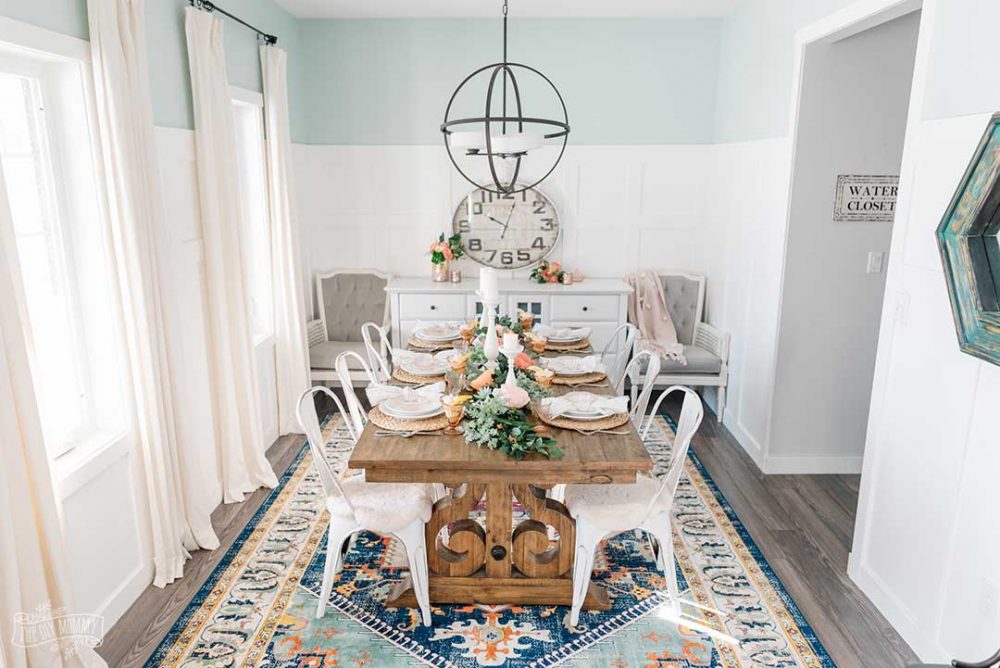
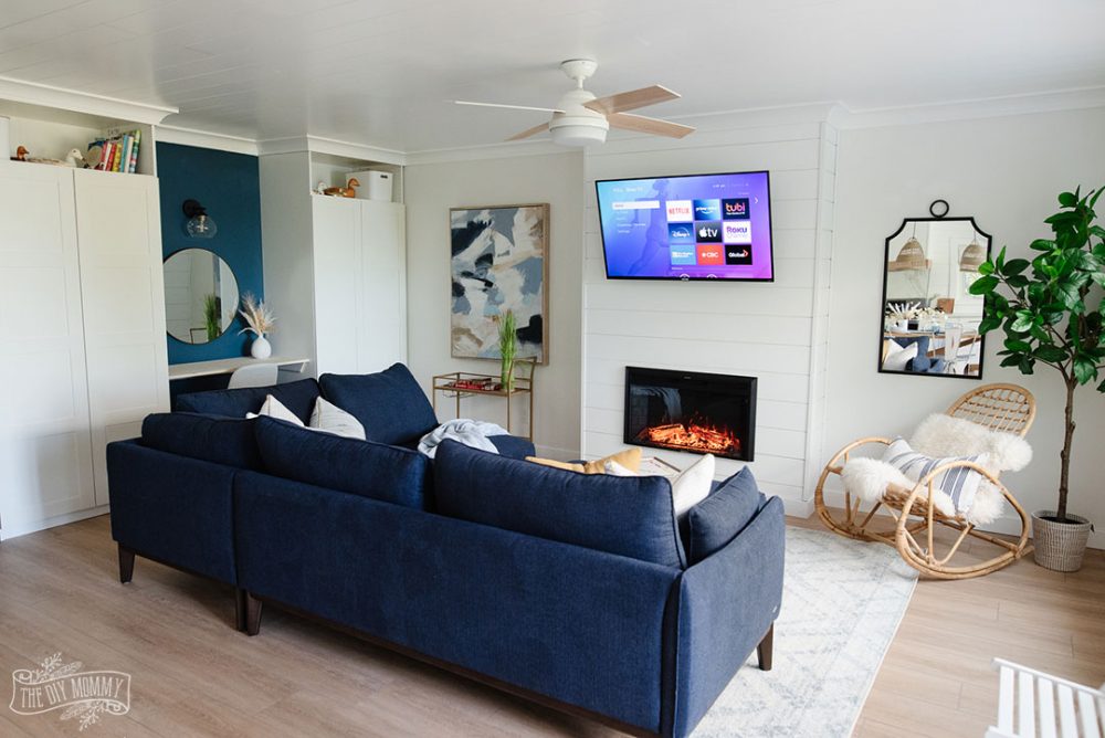
(I always default to shades of white, greens and blues because I love to create a sense of calm.)
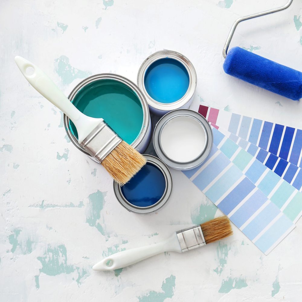
Mistake 2: You’re choosing paint colors based on the paint chip alone
I’ve done this before because I’ve been on a time crunch but I DO NOT recommend it. Looking at paint chips in the paint store, and then buying your can of paint immediately rarely works. Why? There are two reasons:
- The paint will look a lot different on a larger area vs the small chip. It might look subtle on the chip, but then once the color is on an entire wall it will probably look more saturated.
- The lighting in the store will be different than the lighting you have in your home. The way the light bounces off your walls can make paint colors look completely different.
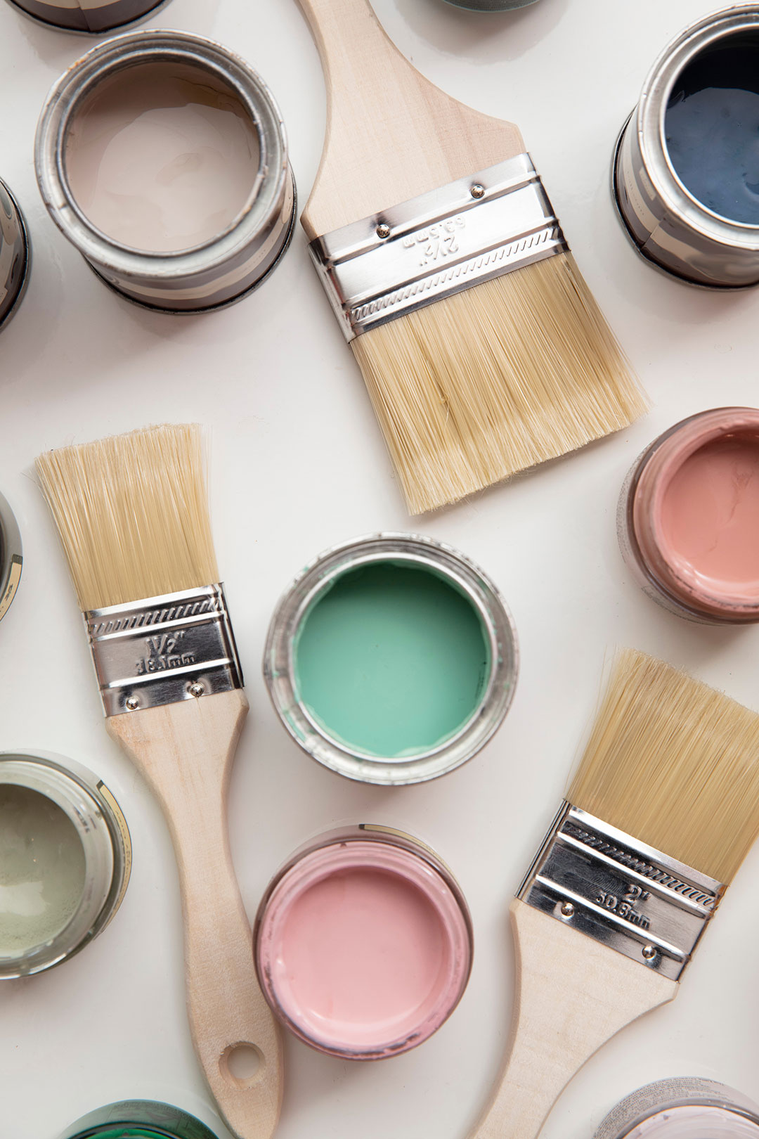
Instead, I recommend choosing a few paint colours you like and then buying small sample pots of those colors. The pots will usually only cost you around $5 dollars each and can save you a lot of money in the long run.
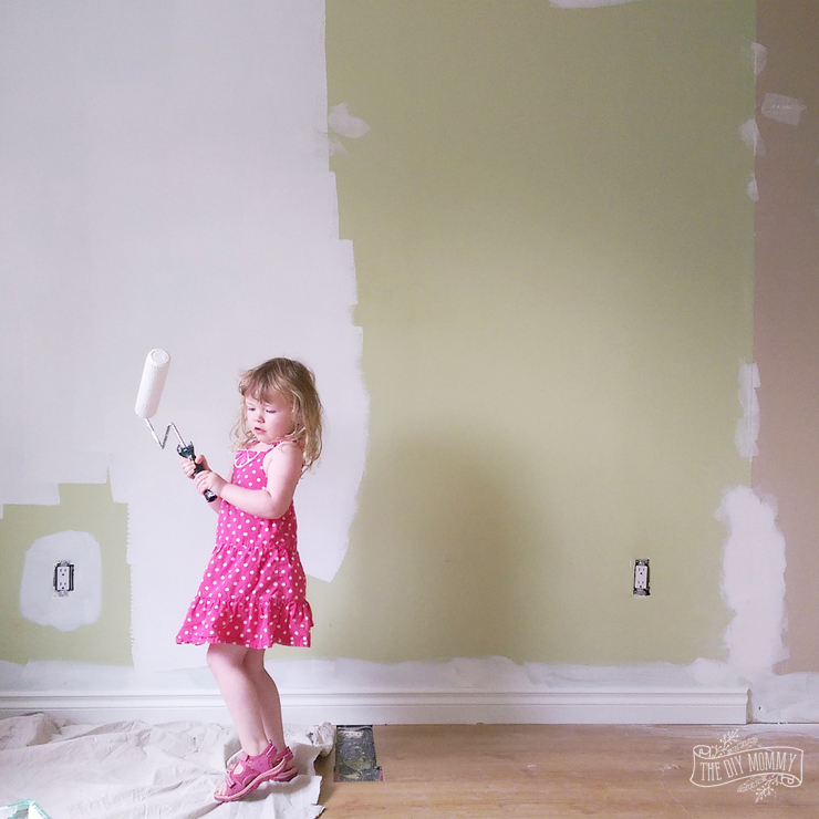
Paint a 3 foot by 3 foot square (or bigger!) of each color on your wall. See how the colors look at all times of the day. You might be surprised at how different the paint looks on your walls! I notice this most dramatically when testing white paint colours. You can really experience the undertones of the paint (whether they’re blue, yellow or beige) when you paint large swatches.
Mistake 3: You’re choosing paint colors that looked good in someone else’s home
This is similar to Mistake #2. Just because the color looks good elsewhere doesn’t mean it’ll work in your space! If there’s a specific colour you love that you’ve seen in another home, it’s still wise to test it in your space. Paint that full 3 x 3 foot swatch on your wall before committing. The lighting in your home, the exposure of your home (South light is a lot different than North light!), and the size of your room will affect how a paint colour looks.
Here’s my favourite method for choosing paint colours that I find WORKS:
- Create a mood board on Pinterest with room inspiration
- Choose possible paint color families based off the photos and mood you want to create (blues? greens? whites? etc)
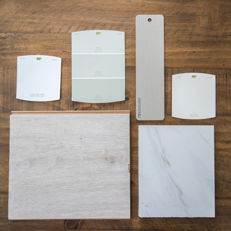
- Go to the paint store and choose some specific paint chip colors you like within that color family. (TIP: choosing colours with a bit of grey in them makes them look more sophisticated.)
- Narrow those colors down to your favourite 3-5 colors and buy sample pots of those
- Paint 3 x 3′ swatches of those colours on your wall. Monitor how they look over the course of a few days, in all light situations
- Choose your favorite color and buy your paint!
THIS WEEK’S CHALLENGE:
If you’re considering painting a room in your home, start putting together a Pinterest board of spaces you love. Are there any common elements in the photos like wall colour, floor color and furniture style? Is there a mood that these photos exude? Write down the common elements and common mood of the photos you’ve Pinned. Then, tell me what colour family you think would work for the wall colour in your space in the comments below. Happy painting!